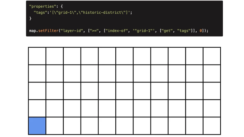
GeoJSON Network Trace is a Mapbox GL JS plugin which enables upstream and downstream network tracing for seamless point and linear GeoJSON data. It was created as a quick and simple method to validate linear storm and sewer networks. In the original version I utilized TurfJS and booleanPointOnLine(), however this was too resource intensive. I swapped this method out for a simple for loop on the coordinate array of each line in the network to check for the existence of the origin point.
For more background on this tool see this blog post.
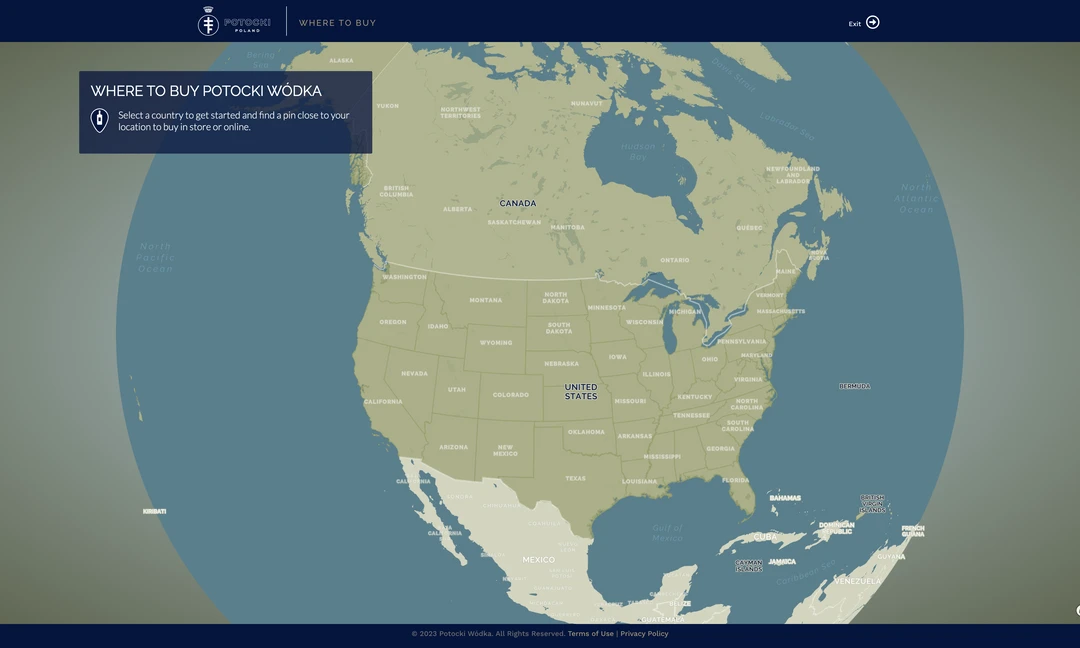
Written in Vanilla JavaScript, this project uses Mapbox GL JS to showcase stores and online purchasing options for Potocki Vodka out of Poland. Certain elements of the application were assisted by various AI tools, such as generating centroids and bounding boxes for countries.
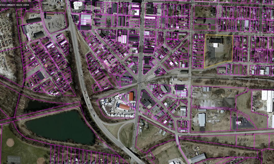
This project uses the sql.js-httpvfs library to serve vector and raster tiles from mbtiles hosted on object storage. The mbtiles could live alongside the website or be hosted on any publicly accessible url. A service worker intercepts the tile requests then returns tile data from the mbtiles fetched using simple SQL queries.
|
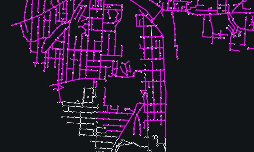
This project consists of a NodeJS script that generates a GTFS feed and interactive map. The only requirements are a GeoJSON routes file, a GeoJSON stops file, and a handful of required static GTFS text files. The result is a feed that can be published to Google, Transit, or any transit feed service, as well as an interactive map with schedules for each route. The schedules can be fixed route with specific times or loop routes that run every hour.
The linked demo is a modified version of the original project (no longer maintained) in collaboration with Etch for Licking County Transit in Ohio.
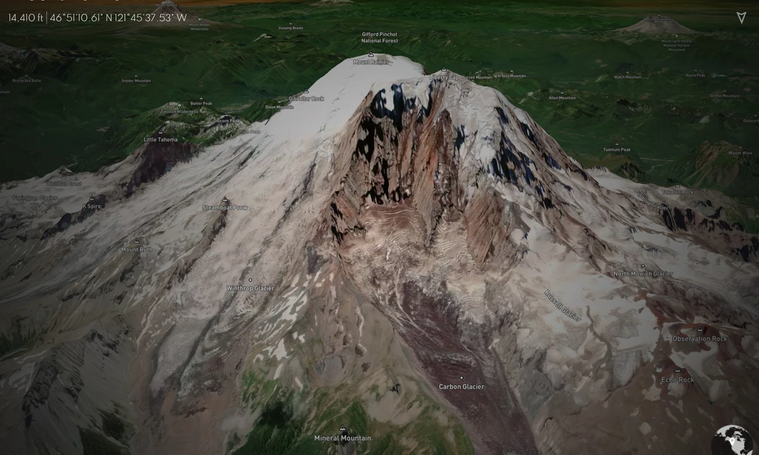
An exploration of the Mapbox GL JS 3D terrain functions, using the tallest US mountain peaks in each state as the study subject. Each map view in this demo project was carefully selected to provide an excellent view of the peak and its surroundings. The terrain extrusion still has a tendency to crash browsers.
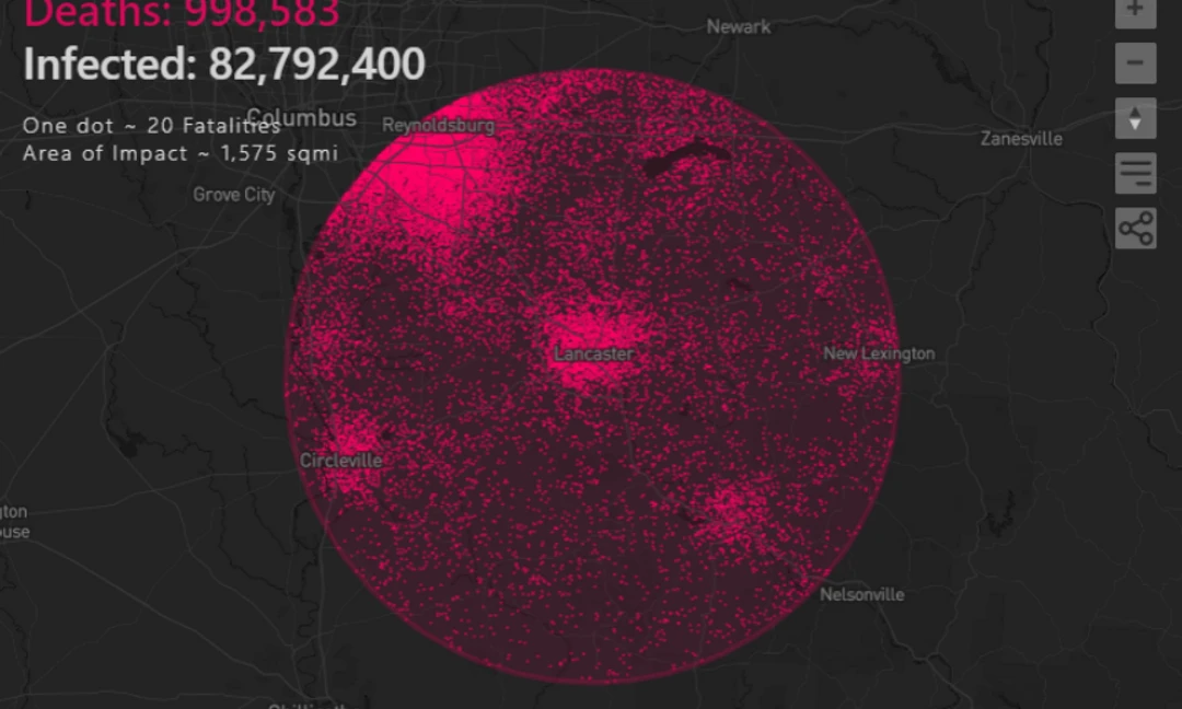
This project is based on the amazing map Brazilian Lupa. It uses a dot density visualization to represent deaths from US COVID-19 clustered in one geographic area. The populations are based on US Census Block Groups, with one dot representing 20 US deaths. All statistics are generated client-side using vector tiles and web-workers
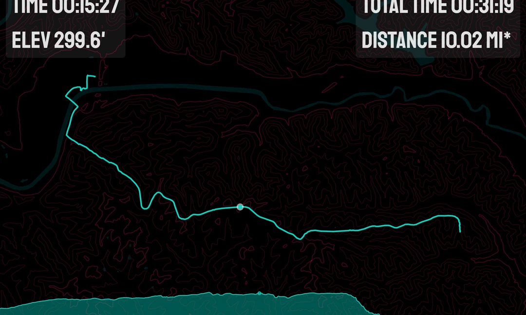
This pojects uses the medium of GPS tracks to explore the linking of charts and maps. The application has a dark and light theme with custom map styles for each. The display can be exported to a an image by clicking in the upper right corner of the visualization.